

Is your WordPress website truly ready for the mobile-first world? With over half of all internet traffic now happening on smartphones and tablets, an unresponsive site isn't just an inconvenience — it's a critical barrier to reaching your audience, boosting your SEO, and growing your business. Perhaps you've already felt the frustration of navigating a clumsy website on your phone, or maybe you're overwhelmed by the sheer number of "responsive" themes promising the world.
Choosing the right WordPress theme is pivotal. It dictates not only your site's aesthetic but also its performance, functionality, and, crucially, how gracefully it adapts to every screen size. While most modern themes claim responsiveness, separating the truly flexible from the merely functional can feel like a daunting task.
But what if you didn't have to guess? What if you had an expert-vetted guide to the themes that consistently perform, adapt, and impress, regardless of the device your visitors are using?
In this comprehensive guide, we cut through the noise. We've rigorously tested and hand-picked the best responsive WordPress themes designed to deliver an impeccable user experience on any device, from a desktop monitor to the smallest smartphone screen. Get ready to discover the themes that will future-proof your website, captivate your audience, and give you a significant edge in today's competitive digital landscape.
Insider Tip: Need help designing your business website? You can hire a ShareWordpress expert to take care of the tough stuff while you focus on growing your business. Starting at just $599!
Short on time but eager to make an informed decision? We get it. Here are our top three recommendations for anyone seeking a powerful and perfectly responsive WordPress theme to kickstart their project.
Before diving into the individual theme reviews, it's essential to understand why responsiveness is non-negotiable and how we select the themes featured in this guide.
A truly responsive WordPress theme isn't just about shrinking or expanding content; it's about intelligently adjusting your entire website to provide an optimal viewing and interaction experience, regardless of the user's screen size or device. Your site needs to look equally stunning and function flawlessly on mobile phones, tablets, and desktop computers.
The statistics speak for themselves: nearly 55% of global internet traffic originates from mobile devices. This means over half of your potential audience will encounter your website on a smaller screen. If your site doesn't adapt gracefully—if content overlaps, buttons are unclickable, or navigation is clunky—you risk:
This is precisely why adopting a responsive WordPress theme isn't just a best practice; it's a fundamental requirement for success in today's digital landscape.
We don't just recommend themes based on popularity. Our team undertakes an exhaustive evaluation process, personally testing each theme for:
Beyond these core pillars, we also specifically look for:
By adhering to these rigorous standards, our goal is to present you with only the highest-caliber responsive themes that empower you to build a stunning, high-performing website for any need, skill level, or budget.
For over 16 years, ShareWordpress has been at the forefront of the WordPress ecosystem. We don't just talk about WordPress; we live and breathe it, managing a diverse portfolio of websites ourselves. This extensive, hands-on experience grants us unique insights into what truly makes a theme excel, particularly concerning its responsiveness and visual appeal across all devices.
Every theme in this guide has undergone our meticulous review process, ensuring it meets our high standards for mobile-friendliness, performance, and overall quality. You can dive deeper into our testing philosophy and commitment to unbiased recommendations by exploring our editorial process.
With that assurance, let's explore the themes that will empower your WordPress site to shine on every screen.
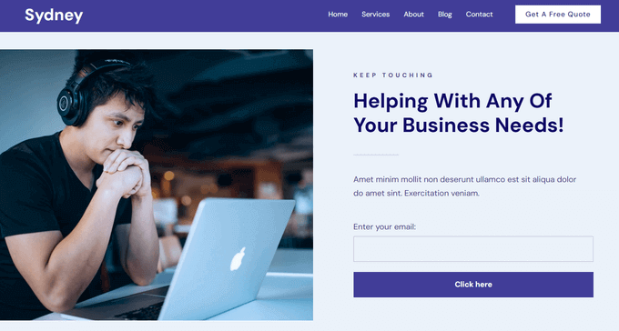
Sydney stands out as a highly versatile WordPress theme, engineered to simplify website creation for businesses and professionals alike. Equipped with over 28 pre-designed starter templates catering to various niches like fashion, restaurants, and corporate sites, it eliminates the need to build from scratch.
During our testing, Sydney's customization capabilities truly impressed us. It offers 8 distinct header styles that can be finely tuned for both desktop and mobile views, ensuring consistent branding. Its comprehensive library of pre-built sections allows for easy drag-and-drop assembly, making it incredibly intuitive to craft unique layouts, manage sidebars, and achieve your desired aesthetic. Color palettes, custom fonts, and a user-friendly interface give you full creative control.
Bloggers will appreciate its built-in features, including 7 layout options, effortless social sharing, and even a unique progress timer to enhance reader engagement. As expected, Sydney performs exceptionally well, offering full responsiveness, lightning-fast load times, and robust SEO optimization. For those on a budget, a free version of Sydney provides a solid starting point, albeit with fewer features.
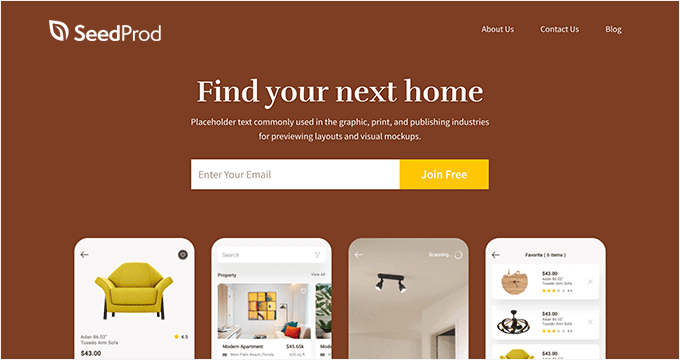
SeedProd isn't just a theme; it's a complete WordPress theme and page builder plugin, making it an invaluable asset for anyone looking to create custom, responsive websites with unparalleled ease. Its intuitive drag-and-drop interface empowers beginners and experts alike to design breathtaking custom themes.
We rely on SeedProd across several of our partner websites, particularly for its exceptional landing page capabilities. Our detailed SeedProd review provides deeper insights into why it's a top choice.
One of SeedProd's most compelling features is its extensive collection of professionally designed starter themes. You can select a template that aligns with your vision and then meticulously customize every element using the powerful drag-and-drop builder. The freedom to build a theme entirely from scratch, bypassing templates, offers ultimate creative flexibility.
A significant advantage is that every layout developed with SeedProd is inherently mobile-friendly. The editor includes a handy feature allowing you to instantly preview your site across different screen sizes (phones, tablets, desktops) before publishing, ensuring seamless responsiveness out of the box. The integration of SeedProd AI further simplifies content generation, significantly accelerating the website creation process.
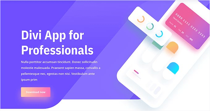
Divi reigns as a premier drag-and-drop WordPress theme and page builder, offering an astounding array of layouts and templates tailored for diverse website needs. Its visual builder makes design accessible, allowing you to see your changes in real-time.
During our comprehensive testing, we were highly impressed by Divi's ability to create and save custom layouts, which could then be effortlessly exported and reused across multiple Divi installations — a massive time-saver for agencies or serial website creators. For more on our hands-on experience, consult our in-depth Divi review.
Divi eliminates the need for CSS knowledge; you can seamlessly modify your site's colors, fonts, headings, and much more directly within its intuitive interface. Crucially, Divi is fully responsive by design, ensuring your website looks pristine on any device. Beyond aesthetics, Divi is meticulously crafted for superior WordPress SEO, helping your site achieve better rankings in Google and other search engines, driving more organic traffic.
Neve is a dynamic and modern responsive WordPress theme renowned for its lightweight architecture and blazingly fast performance. Our testing revealed that Neve not only prioritizes speed but also renders your website as native Accelerated Mobile Pages (AMP), ensuring an ultra-fast experience on mobile devices.
Neve offers extensive customization options for your header, footer, and overall website layout. It boasts full compatibility with WordPress's native block editor (Gutenberg) and integrates seamlessly with popular page builders such as Elementor Pro and Visual Composer, providing maximum flexibility for design.

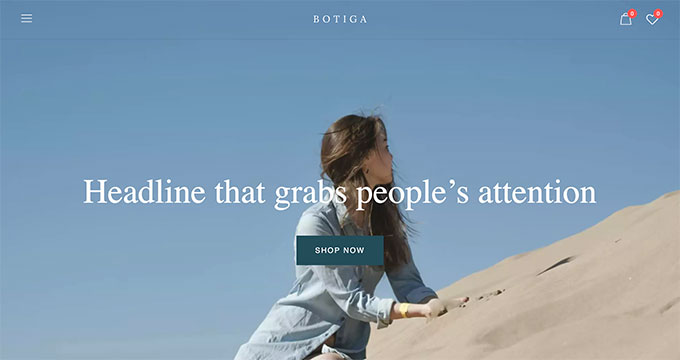
Botiga Pro is an exceptional responsive WordPress theme, ideally suited for thriving business websites and robust eCommerce stores. It offers a diverse range of professionally designed site templates, from clean and minimal to bold and modern, all importable with a single click.
During our evaluation, we discovered an abundance of customization possibilities. Botiga Pro allows for different layouts on each page with easy switching options. You can even design unique custom templates for your shop pages, thank you pages, and 404 error pages. Its full responsiveness guarantees your site looks impeccable across all devices, including desktops, tablets, and mobile phones.
Crucially, Botiga Pro natively integrates with WooCommerce, offering beautiful product galleries, advanced product filters, live SKU search, wishlists, and sticky "add to cart" buttons. For those starting out, a free version of Botiga is also available.
OceanWP stands as a robust and feature-rich responsive WordPress theme designed for unparalleled versatility. It supports virtually any website type, performing equally well for business sites, eCommerce platforms, and WordPress blogs.
Our team conducted a thorough OceanWP review detailing our extensive experience with the theme. OceanWP comes with a clean, extensible layout that is easily customizable using widgets, various page templates, and dedicated theme settings. It's renowned for its fast loading speeds and offers comprehensive WooCommerce support, making it an excellent choice for online stores.
Inspiro is a powerful WordPress multipurpose theme meticulously crafted for photographers, videographers, and anyone focused on visually rich content. Our setup experience highlighted its effortless integration with third-party video platforms, allowing for seamless display of your video assets.
Among its many features, Inspiro includes a customizable full-width header background, perfect for showcasing an impactful image or video. It integrates flawlessly with popular page builder plugins for deeper customization, ensuring you have full control over your site's appearance.

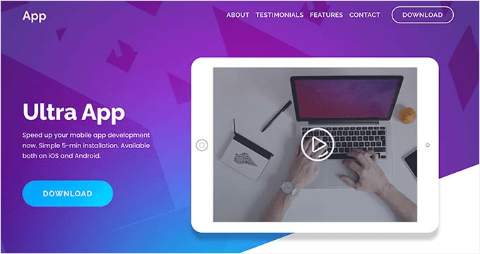
Ultra is a high-powered, multipurpose WordPress theme equipped with a built-in drag-and-drop page builder. It offers a wealth of pre-designed layouts, sections, and templates, providing an excellent foundation for building almost any type of website.
This theme is packed with advanced features such as smooth parallax scrolling, engaging animations, interactive counters, integrated Google Maps, and versatile sliders. Ultra gives you the tools to create a visually dynamic and highly interactive user experience.
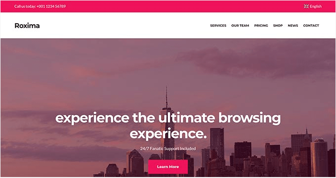
Roxima is an elegantly designed WordPress theme tailored for professional business websites. Its fully responsive design ensures a flawless presentation across all devices. It comes complete with multiple custom widgets and diverse layout choices to help you craft a unique presence.
The theme includes essential sections like "About," "Services," "Portfolio," "Clients," and "Team," which can be easily arranged on your homepage using its intuitive drag-and-drop functionality. Roxima's beginner-friendly theme options panel streamlines the website building process, allowing for quick setup and customization.
Guten Theme is a contemporary WordPress theme perfectly optimized for the new WordPress block editor (Gutenberg). This responsive theme provides multiple built-in layouts for headers, footers, and blog sections, enabling you to effortlessly create stunning content layouts for your posts and pages.
Guten Theme offers robust customization with custom colors and font settings. It is fully compatible with WooCommerce and allows for extensive personalization directly through the WordPress live customizer.

Astra is a widely popular, multipurpose WordPress theme celebrated for its clean code, flexibility, and user-friendliness. Beyond its inherent responsiveness, Astra boasts advanced features like a dedicated Mobile Header module. This allows you to fine-tune header breakpoints, set different logos, menu styles, and colors specifically for mobile devices, offering unmatched control. Our detailed Astra review provides deeper insights.
Astra is a feature-rich, stable, and high-performing theme that ensures your website looks exceptional on all devices. It also provides comprehensive support for RTL languages, making it a global solution.

Benson is a fully responsive WordPress theme specifically tailored for photographers and portfolio websites. It supports a variety of image layouts and facilitates the integration of video and image slideshows, allowing your visual content to shine.
Benson includes dedicated sections for presenting portfolio items, displaying client testimonials, and integrating a blog. Other notable features include robust eCommerce support, a pre-integrated contact form, a social media menu, and compatibility with leading page builders like Elementor and Visual Composer.

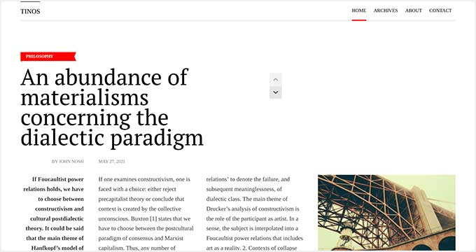
Tinos is a beautifully crafted, fully responsive WordPress blogging theme. It features prominent, large sections designed to highlight your writing, featured images, and offers multiple header layout options for a customized look.
Setting up Tinos is remarkably easy, thanks to the live theme customizer. It provides pre-set color schemes and the flexibility to create your own, ensuring your blog's aesthetic aligns with your brand. A significant highlight is its strong optimization for SEO, as well as superior speed and performance, making it an ideal choice for serious bloggers.
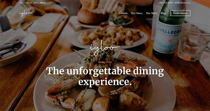
Igloo is a responsive WordPress theme designed with restaurants, cafes, and food-related businesses in mind. It comes complete with a built-in menu management section, allowing for seamless and attractive display of your culinary offerings.
Igloo features large, impactful featured images and a stunning homepage slider with a bold call to action. It also includes dedicated sections for showcasing customer testimonials, creating beautiful galleries, and a prominent contact form, ensuring all key restaurant information is easily accessible.
Corner is a thoughtfully designed WordPress theme catering to creative professionals. It offers robust functionality for displaying your portfolio, showcasing photography, or serving as a refined personal blog or website.
The theme supports unlimited color variations and provides a wealth of customization options to match your unique brand. It's fully SEO-friendly, translation-ready, and seamlessly integrates with popular contact form plugins like WPForms lite or pro, making it a comprehensive solution for creatives.

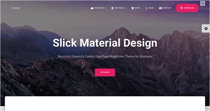
Hestia is a remarkably free, responsive WordPress theme packed with powerful features that belie its price tag. Our exploration revealed its companion plugin, which significantly simplifies setup by adding essential elements like testimonials, services, and customizable homepage sections.
Hestia is fully compatible with popular free page builder plugins and provides out-of-the-box support for WooCommerce, making it an excellent choice for those looking to build an online store or complex site without a significant investment.
Tusant is a mobile-responsive WordPress theme meticulously designed for podcasters. It also serves as an excellent option for music or video-centric websites, providing native support to beautifully display podcast episodes, vlog entries, and audio playlists.
Tusant offers several layouts for showcasing podcast episodes in both grid and list views. Extended settings within the live customizer allow for detailed theme color customization. Furthermore, it supports drag-and-drop page builder plugins, enabling easy creation of custom landing pages.

Nozama is a visually appealing responsive theme specifically crafted for WooCommerce stores. It boasts full WooCommerce integration with a highly customizable storefront, allowing you to tailor every aspect of your online shop.
The theme includes several WooCommerce-specific custom widgets, attractive templates for product and product category pages, and seamless social media integration. Its compatibility with popular page builder plugins empowers you to easily create compelling landing pages for your website.

Vasco emerges as one of the top WordPress themes specifically designed for influencers, empowering them to showcase their expertise and explore new opportunities. Its modern front page layout features a prominent call-to-action, strategically boosting conversions.
Vasco is fully eCommerce-ready, making it straightforward to sell online courses or establish a membership community. It's built with fast loading speeds and adheres to best SEO practices, ensuring optimal visibility and user experience. Other notable features include custom widgets and unique visual elements, all easily configured via an intuitive theme options panel.

Spencer is an elegant WordPress business theme boasting a fully responsive design. It features a completely widgetized frontend layout for the homepage, allowing for effortless drag-and-drop arrangement of content modules.
The theme includes multiple page templates, custom widgets for integrating social media, and powerful content discovery features. Importantly, Spencer supports all popular plugins, including the widely used Elementor page builder.

Prime News is a responsive WordPress theme meticulously crafted for news and magazine websites. It features a clean, minimalist layout that expertly highlights your articles and images, ensuring content takes center stage.
With Prime News, you get a sticky navigation menu at the top and a collapsible sidebar menu for improved user experience. It also includes a dedicated header widget area, a dynamic breaking news ticker, and a prominent featured content section. Customization is straightforward with easy widget integration and color selection.

FitnessLife is an eCommerce-ready WordPress theme specifically tailored for health, wellness, and lifestyle businesses. It showcases a beautiful modern homepage layout featuring a large header and a prominent call-to-action, designed to immediately capture visitor attention.
The theme comes equipped with several custom post types, multiple widget areas, and unlimited color schemes. It's also optimized for the WordPress block editor, allowing you to create consistent, custom content layouts that seamlessly integrate with the theme's overall design.

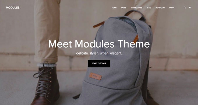
Modules is a fully responsive WordPress theme ideal for advertising and marketing agencies, freelancers, and businesses. It presents a stylish, minimal design paired with elegant typography and robust portfolio functionality.
Optimized for the WordPress block editor, Modules allows you to craft stunning content layouts with ease. It includes a variety of pre-made modules such as pricing tables, testimonials, featured posts, a services section, lead boxes, and much more, providing a comprehensive toolkit for professional presentation.
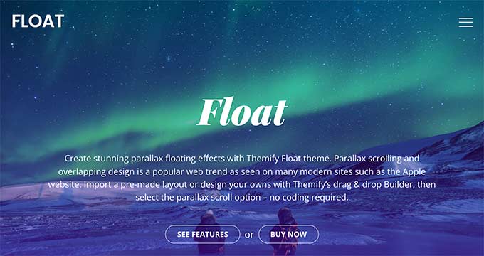
Float is a highly customizable responsive WordPress theme renowned for its captivating parallax scrolling effects and integrated page builder. It offers dozens of sophisticated layouts and multiple ready-to-use templates, providing an excellent starting point for creating visually stunning web pages.
This theme is packed with features typical of a premium WordPress theme, including social media integration, custom backgrounds, unlimited color options, and versatile custom widgets, ensuring comprehensive design control.
Elara is an excellent theme choice if you're looking to start a food blog. This elegantly designed, fully-responsive WordPress theme is custom-made for food bloggers and recipe websites.
It features a modern, spacious design with beautiful typography and an elegant display of images and media. Elara includes built-in ad spots, featured recipe sections, versatile sliders, prominent banners, seamless social media integration, and user-friendly drag-and-drop widgets, providing a complete solution for showcasing your culinary content.

Felt is a powerful responsive WordPress news and magazine theme, loaded with an impressive array of features. Its homepage layout offers an optional full-screen slider, seamlessly transitioning into your recent articles as users scroll, delivering an immersive experience.
It comes with two navigation menus at the top, immersive featured images, multiple layout configurations, diverse header styles, and integrated social media icons. Felt is also exceptionally easy to set up, making it a strong choice for dynamic content sites.

Responz is a versatile, multi-purpose WordPress responsive theme. It showcases a beautiful three-column layout characterized by an elegant design and sophisticated typography, creating a visually appealing experience.
The theme offers multiple layout options, including various sidebar configurations or a full-width homepage. You can also choose between list view or grid view post layouts, providing flexibility for content presentation. In addition, Responz boasts all the essential features of a premium theme, such as custom background, flexible headers, custom widgets, and extensive color options.

The Traveler is a responsive WordPress theme designed for travel and tourism websites. It features a stunning grid-based layout for the homepage, perfect for showcasing destinations and travel stories. The theme also includes a seamless Instagram feed integration, allowing you to display your latest photos directly on your site.
With layout choices for archive pages and an extremely straightforward setup process, The Traveler is an excellent choice for aspiring and established travel bloggers alike, even for absolute beginners.

Landing is a specialized WordPress landing page theme that empowers you to build high-converting landing pages using the intuitive drag-and-drop Themify Builder. It comes equipped with ready-to-use builder templates, offering an excellent starting point for various campaigns.
The theme provides multiple header design options, comprehensive portfolio management, event integration, and full WooCommerce support, making it simple to launch your own online store.

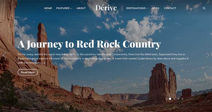
Dérive is a versatile and fully responsive WordPress theme suitable for blogging, news, travel blogs, and magazine websites. It offers a highly customizable homepage featuring a prominent content slider, a dedicated categories section, and a convenient 1-click demo content installer for quick setup.
Dérive provides multiple page templates, custom color palettes, diverse fonts, support for a custom logo, and flexible background color options. The theme also includes several custom widgets, multiple sidebars, and various widget-ready areas, providing extensive customization possibilities.
Velure is a beautifully designed WordPress magazine theme crafted to showcase your content with elegance and impact. It features a prominent content slider, a dynamic video slider, a curated featured categories area, and strategically placed ad spaces to monetize your site.
Other notable features include a custom logo upload option, seamless Instagram integration, multiple page layouts, and several widget-ready areas, providing comprehensive tools for building a sophisticated online magazine.

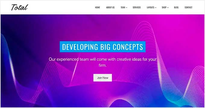
Total is a free WordPress theme, making it an excellent choice for small businesses or startups operating on a bootstrap budget. It offers a clean and simple layout, ideal for showcasing your products and services effectively.
Its homepage is intelligently designed with distinct areas for a slider, an "About Us" section, a progress bar, a portfolio, testimonials, and blog posts. Total also includes multiple widget-ready areas and full customizer support, allowing for easy adjustment of theme settings without coding.
Patch is a stylish blog and magazine theme for your WordPress site. This elegantly designed template is fully mobile responsive, ensuring your content automatically adjusts and displays beautifully on smaller screens, enhancing readability and user experience.
You can leverage different post formats for special content pieces, including videos, quotes, podcasts, and image galleries. Customizing your colors, fonts, and other elements is straightforward, directly accessible within the WordPress customizer.

Elite is a stunning WordPress theme well-suited for both business and eCommerce websites. Its homepage prominently features a full-screen background image complemented by a clearly displayed call-to-action button.
The theme includes support for custom logos, unlimited color options, Google Fonts integration, and multiple page layouts for both blog posts and pages. Its user-friendly design, widgetized homepage, extensive customizer support, and dedicated theme options page ensure an easy setup experience.

Pepper+ is a versatile, all-purpose WordPress theme offering several ready-to-use designs for businesses and blogs. It adopts a modular design approach, providing intuitive drag-and-drop modules for creating diverse layouts with ease.
Pepper+ is a retina-ready theme, ensuring crisp visuals on high-resolution screens. It offers full support for WooCommerce and is compatible with multilingual websites through plugins like WPML. Its beginner-friendly user experience is further enhanced by simple 1-click installers and a rapid theme setup process.

Foodica is a beautifully designed WordPress theme built specifically for food blogs, recipe websites, and restaurants. This theme includes appealing color schemes, a dedicated recipe index, a captivating featured slider, and full WooCommerce integration.
It also features built-in ad zones for easy monetization and a comprehensive theme options panel that streamlines the setup and customization of your website.

Bordeaux is a premium WordPress theme tailored for hotels. It encompasses all the standard features expected from a high-end theme, ensuring a polished and professional online presence.
Bordeaux is fully responsive, guaranteeing an excellent appearance on all devices and screen sizes. It's highly optimized for speed, performance, and SEO, driving better search engine visibility. All theme settings are easily configured via an intuitive theme options panel. Beyond standard features, Bordeaux includes hotel-specific functionalities, allowing seamless integration with popular hotel booking systems directly into your WordPress site.

Kale Pro is a beautiful WordPress theme designed for food blogs, recipe websites, and restaurants. It features an attractive homepage layout with a prominent slider at the top, followed by your featured content, creating an engaging visual flow.
With Kale Pro, you can effortlessly add recipes using its dedicated recipes shortcode builder. It offers specific areas for banner ads and custom widgets, allowing you to strategically place content on your homepage and sidebars. For rapid deployment, its 1-click demo content installer ensures a quick and easy setup.

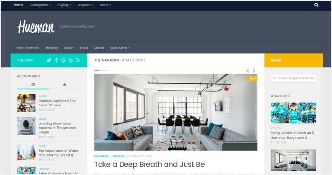
Hueman is a free, multi-purpose WordPress theme that combines mobile responsiveness with a generous array of features. It includes its own integrated theme customization panel, making setup and personalization remarkably simple and intuitive.
With Hueman, you gain access to multiple page layouts, customizable headers, backgrounds, logos, and extensive color options. You can choose between 2-column or 3-column layouts and utilize various page templates, providing significant flexibility for your site's design.
Blocksy is a free multipurpose WordPress blog theme distinguished by its flexible features and a fully responsive layout. It integrates seamlessly with most page builder plugins, even recommending one upon activation to enhance your building capabilities.
Remarkably for a free WordPress theme, Blocksy offers a wealth of customization options. All these settings are conveniently accessible and adjustable directly through the WordPress customizer, making design modifications intuitive and efficient.
Elegant is a responsive WordPress theme ideally suited for artists, photographers, and designers. It includes built-in modules for effortlessly integrating your photo galleries, versatile sliders, and both video and audio content.
The theme also features an easy-to-use drag-and-drop page builder. This powerful tool allows you to create entirely new page layouts or modify existing built-in designs, giving you complete creative freedom over your visual presentation.

Angle is a clean WordPress multi-purpose theme that incorporates a drag-and-drop builder for intuitive design. It comes equipped with a built-in portfolio section, dynamic sliders, a visual theme customizer, and multiple layout choices to personalize your site.
Angle is expertly optimized for performance, SEO, and user-friendliness. Its minimalist design makes it an ideal selection for portfolio sites or highly focused blogging platforms where content clarity is paramount.

Parallax is a beautiful single-page WordPress theme known for its captivating parallax scrolling effects and background visuals. It features engaging fly-in elements, a built-in portfolio, and dedicated team post types, perfect for showcasing your brand and personnel.
The theme includes animated progress bars, flexible list and grid layouts, and infinite scroll. Parallax also stands out for its ability to apply image filters (sepia, grayscale, blur) directly, allowing you to enhance visuals without external editing software.

Dixie is a meticulously crafted WordPress theme designed for podcast, video, and music websites. It's fully mobile responsive, ensuring an exceptional multimedia experience for your users, even on smaller devices.
The theme setup is straightforward, with most features working seamlessly out of the box. It offers flexible options to customize colors, layouts, and fonts, enabling you to align the site perfectly with your brand's aesthetic.

Choosing a responsive WordPress theme is only half the battle; knowing how to confirm its flawless display across devices is key. Here's how to ensure your chosen theme performs as expected:
Test the Demo on Your Mobile Device: The simplest and most direct method. Grab your smartphone or tablet and navigate to the theme's live demo. Interact with it as a user would, checking navigation, readability, and image display.
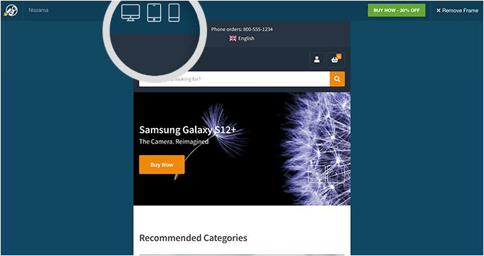
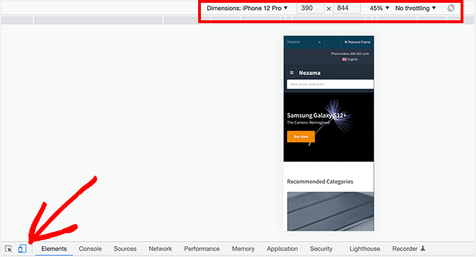
Utilize In-Browser Developer Tools: Most modern web browsers (Chrome, Firefox, Edge) offer built-in developer tools. Right-click anywhere on a webpage, select "Inspect" (or "Inspect Element"), and look for the device toolbar icon (often resembles a phone and tablet). This allows you to simulate various screen sizes and device types directly from your desktop.
Leverage Online Cross-Browser Testing Tools: For a more comprehensive check, consider using dedicated cross-browser testing tools. Simply enter the theme's demo URL, and these tools will render the site across a multitude of browsers and operating systems, highlighting any potential inconsistencies.
By employing these testing methods, you can confidently select a responsive theme that truly delivers a superb experience for all your visitors, regardless of how they access your site.
Selecting the right responsive WordPress theme is more than just a design choice; it's a strategic investment in user experience, SEO, and the future growth of your online presence. We hope this curated guide has demystified the selection process, providing you with the insights and recommendations needed to choose a theme that perfectly aligns with your vision and goals. Remember, a mobile-friendly website isn't just a trend—it's a necessity in today's digital landscape.
Armed with these expert-vetted options, you're now equipped to build a WordPress site that not only looks stunning but also performs flawlessly across every device, capturing more leads, engaging more readers, and standing out from the competition.
To further optimize your website and unlock its full potential, explore these essential ShareWordpress resources:
If you found this article valuable, please consider subscribing to our YouTube Channel for more insightful WordPress video tutorials. You can also connect with our vibrant community on Twitter and Facebook for the latest tips, tricks, and discussions.
